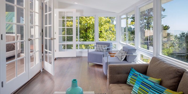
When planning a house it’s essential to pick out a nice palette so your house has a theme. Obviously you have to be careful about what you pick. You’re not going to put a bright orange next to a rosy pink. It’d just be hideous. Many houses like to pick a dark brown or black, and then a white. However, there are many more options than just a dark and a bright. Here are some that I’ve found that add to a great color palette.
Deep Turquoise
Turquoise is a very neutral but bright color. It stands out without really clashing against too many other colors. It’s very versatile, however, many people don’t like it. I think a deep turquoise looks a bit more professional which is why I think it’s more appropriate for an office or house.
Plum
A dark purple or lilac can actually look a lot less immature than you’d think. If you use it sparingly, plum can be a nice addition to your color palette. It’s not necessarily feminine too. Historically a rich purple was known as the color of royalty. Although that might not matter to you now, it still gives off a sort of fancy feel.
Olive
This color may be a bit divisive. Some people may absolutely detest olive, I personally am a fan of it when used sparingly. Some people like to lather their entire house in it. I really don’t like that. However if used for maybe doors or a single room, I think it can add a nice outside feel to a home.
Imperial Red
Red is commonly known as the color of power. So if you’re going to use this color, you need to use it as your main color. After that you could go with some greys to balance out how vibrant it is.
All these colors are just suggestions. Almost any color can fit depending on how you use it, some just may be harder to use than others. There are literally thousands of color palettes that look absolutely amazing.


